
Last week, Icon Map joined the Fabric & Power BI Wales User Group for a session that truly captured why we enjoy working with maps so much.
James Dales shared what mapping in Power BI can look like when you move beyond simple points and bubbles. Using Wales as the focus, he showed our upcoming data catalog capability, adding layered maps to help teams explore relationships, spot patterns and ask better questions of their data.
The session was intentionally demo heavy. Rather than slides and theory, it focused on building reports from scratch using real datasets. The aim was simple: to show how maps can act as the starting point for analysis, not just something added at the end of a report.
Session Highlights
James kicked off by showing how to use geospatial grid systems such as Uber’s H3 and Google’s S2 to aggregate every recorded crime in Wales last year to display and select hotspots that can be used to filter the other charts in the Power BI report.
He then demoed Icon Map’s forthcoming data catalog capability, effortlessly adding in a deprivation layer and police station locations, to examine the correlation between crime and deprivation.
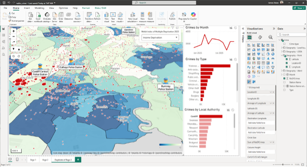
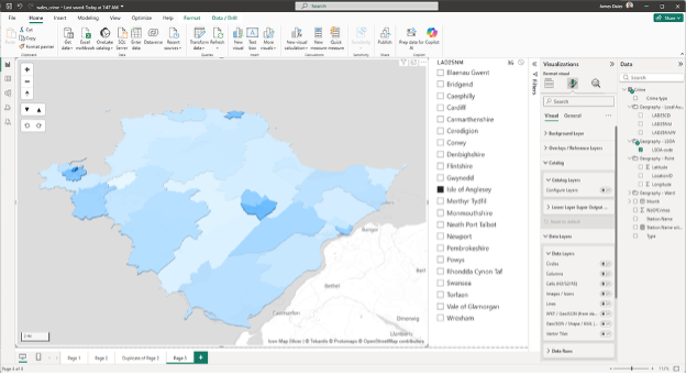
He then showed how layers in the catalog can be bound to Power BI data by aggregating the crimes by census area, creating a 3D choropleth map.
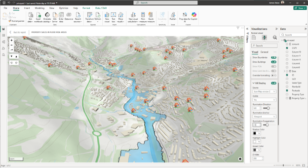
Moving on to a property sales dataset, James plotted every house sold in Wales last month and overlaid these with flood risk areas on a 3D background map based on Ordnance Survey.
Finally, he showed the electricity infrastructure in wales using data loaded from a database, displaying all the electricity cables taking advantage of Power BI’s conditional formatting to determine the colour and size based on type and voltage.
Although Wales provided the backdrop for the demo, the ideas behind it travel well. The same approach applies to teams working with public sector data, operations, research or analytics, anywhere location adds meaning.
As James put it during the session:
“I’m really excited because I’m going to be showing something that nobody’s ever seen before.”
That excitement came through not because something flashy was being shown, but because the approach made complex spatial analysis feel more natural inside Power BI.
What’s Next
If you’re curious about using maps as an active part of analysis rather than a finishing touch, keep an eye on our channels for follow-up content from the session. Or, alternatively, click the link to find out more…