Icon Map turns siloed supply‑chain data inside Power BI or Microsoft Fabric into location‑aware insight, delivering leaner operations, stronger resilience, and profitable growth.
Operational Visibility & Efficiency
Leverage real‑time geospatial visualization to monitor end‑to‑end flows, streamline dispatch, and cut dwell times.
Dynamic route optimization
Recalculate optimal road, rail, or sea legs in response to traffic, weather, or capacity constraints.
Predictive maintenance hotspots
Identify assets with rising failure risk and schedule works before breakdowns disrupt flow.
Yard & port heat‑maps
Highlight congestion and idle equipment to speed turnaround and maximize berth and dock utilization.
Live fleet & asset tracking
View vessels, trucks, rail wagons, and containers on a single map to reduce search time and demurrage.
Turnaround & dwell‑time dashboards
Surface variances against service‑level targets and focus teams on the highest‑impact delays.
See Your Distribution Network, Live in Icon Map
These are real Icon Map renders of a distribution network - three regional
DCs, 120 stores, and their deliveries - built from nothing but ordinary tables.
Every analysis below runs client-side in Power BI or Microsoft Fabric:
the drive-time areas and road-following routes are computed in the browser on
Icon Map's own routing engine, so your depot locations and delivery points are
never sent to an external routing API.
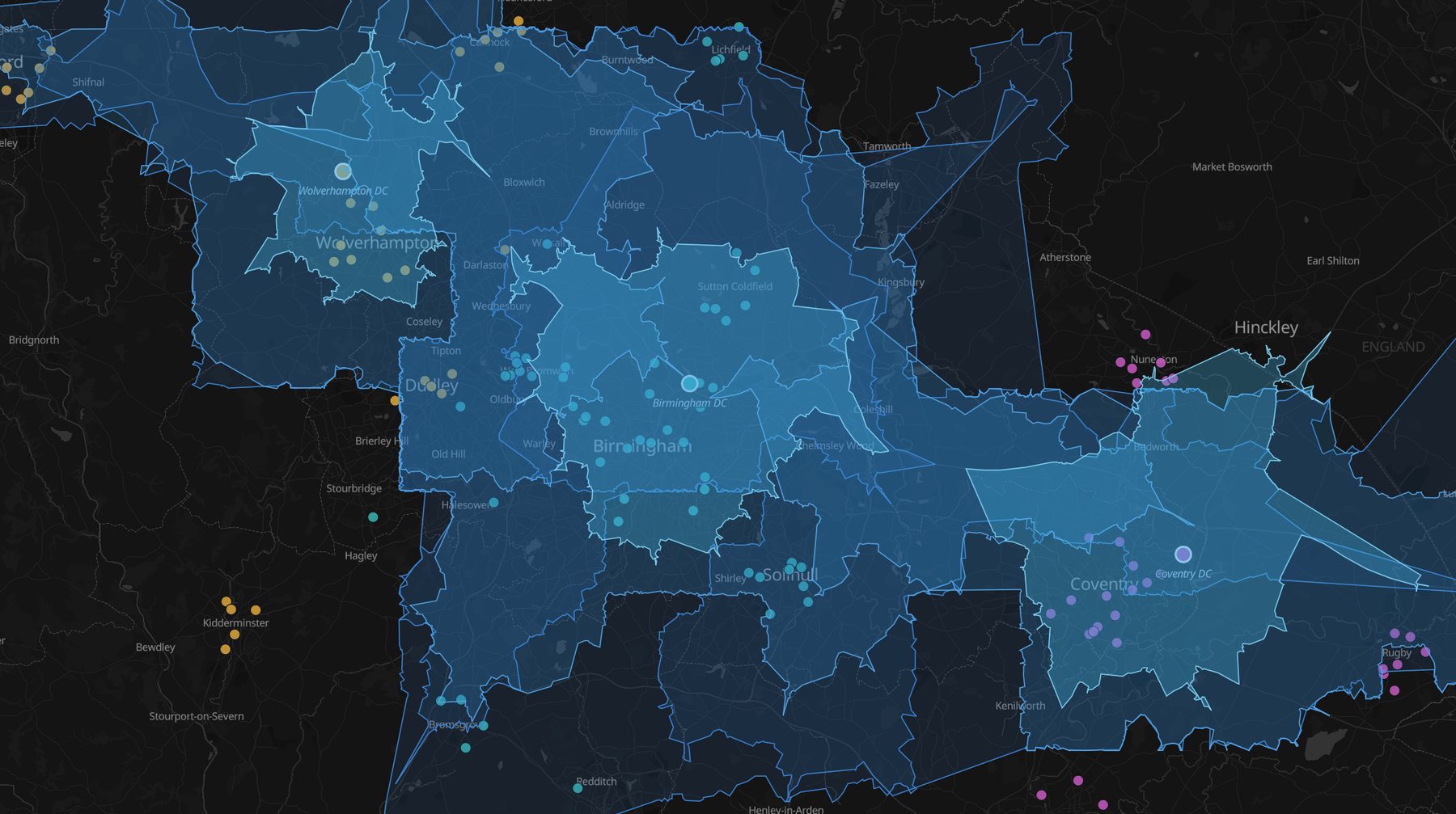
Depot coverage in 10 / 20 / 30 minutes' driving. Nested
drive-time areas computed over the real road network for each DC - motorway
corridors stretch the reach, urban congestion pinches it. Stores are colored
by their serving depot, so coverage gaps and misassignments stand out at a
glance. Rendered live in Icon Map.
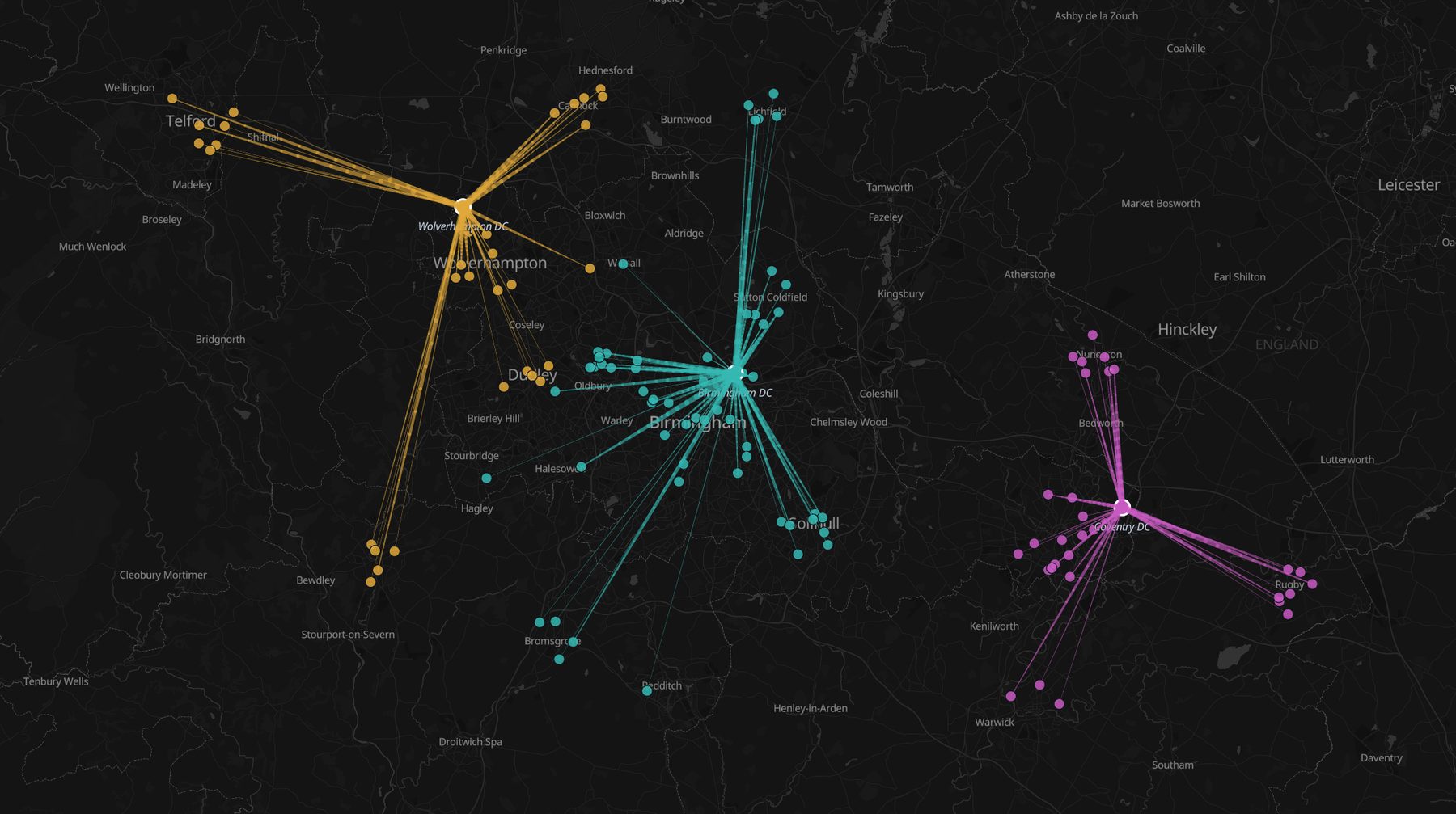
Depot-to-store flows. Line width carries weekly volume,
tapering from depot to store with direction arrows - lane structure and
volume imbalances in one view. Click a depot and every linked chart
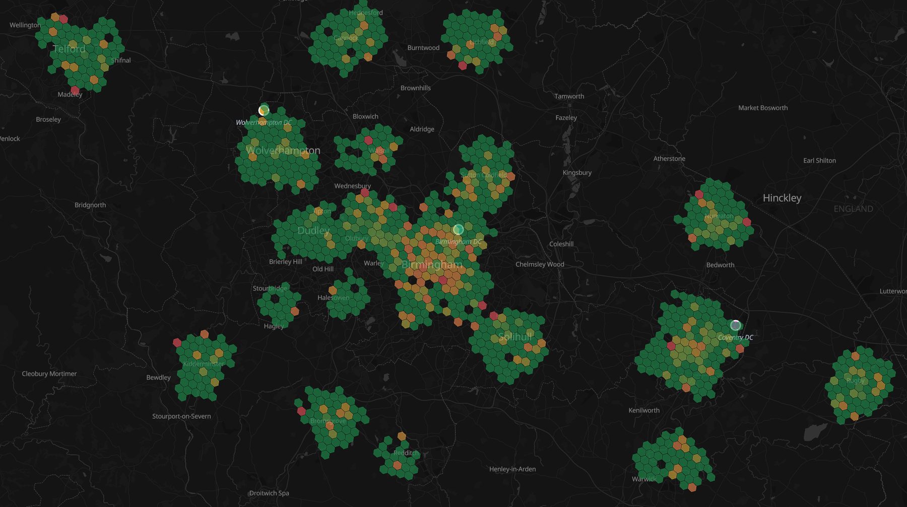
follows.Late-delivery hotspots. Thousands of delivery points
hexbinned and colored by lateness rate - the congestion hotspot glows red
against an on-time network. Select hexes to cross-filter the depots,
lanes, and KPI charts serving them.
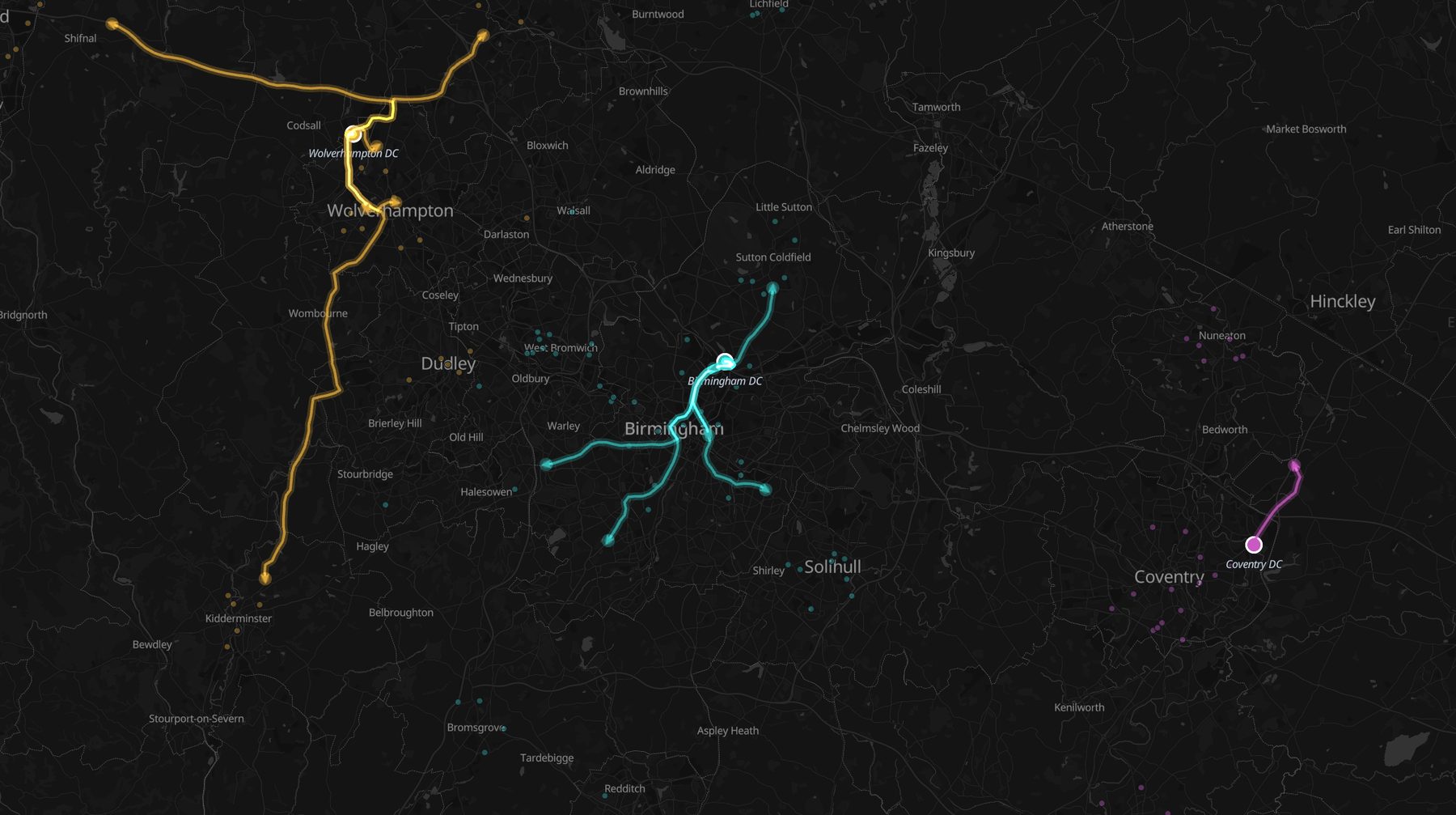
The fleet, mid-shift. Vehicle trails follow the actual
road network with a heading arrow at each truck's latest position, colored
by home depot. Connect a live feed (Eventhouse, GTFS-RT, or your telematics
table) and this view plays in real time with animated playback and stale-fix
fading. Rendered live in Icon Map.
Icon Map for Microsoft Fabric is in
private preview - join the wait list to run these analyses on your own network
data. The same map, chart, and cross-filter machinery is available today in
Icon Map Pro for Power BI.
Renders use a synthetic West Midlands demonstration network;
the drive-time, routing, and aggregation engines are the shipped product.
Network Resilience & Sustainability
Strengthen situational awareness, anticipate disruption, and meet ESG commitments across multimodal corridors.
Bottleneck early‑warning layers
Combine AIS, IoT, and road sensors to flag emerging queues or capacity pinch‑points.
Disruption response mapping
Display alternate terminals, depots, or interchange points to reroute cargo swiftly.
Carbon‑intensity visualization
Map emissions, fuel burn, and empty‑run mileage to support net‑zero strategies.
Risk & compliance overlays
Track hazardous‑goods corridors, customs zones, and security alerts to maintain regulatory adherence.
Climate & severe‑weather impact models
Overlay storm tracks, flood zones, or heat advisories to protect people and assets.
Commercial Insight & Growth
Fuse demand, capacity, and market data in spatial context to unlock new revenue and guide strategic investment.
Lane cost‑to‑serve analysis
Compare profit, volume, and margin by origin‑destination pair to refine pricing and service levels.
Customer segmentation maps
Visualize top clients, churn hotspots, and underserved regions to prioritize sales activity.
Expansion & M&A scenario planning
Overlay competitor networks, terminals, and free‑zone incentives to test growth options.
Capital investment drill‑through
Present portfolio‑level maps with instant drill‑down to project KPIs, strengthening business cases.
Market‑demand forecasting
Combine economic indicators and trade flows to predict where capacity will be required next.
Why Choose Icon Map?
Our customer success stories
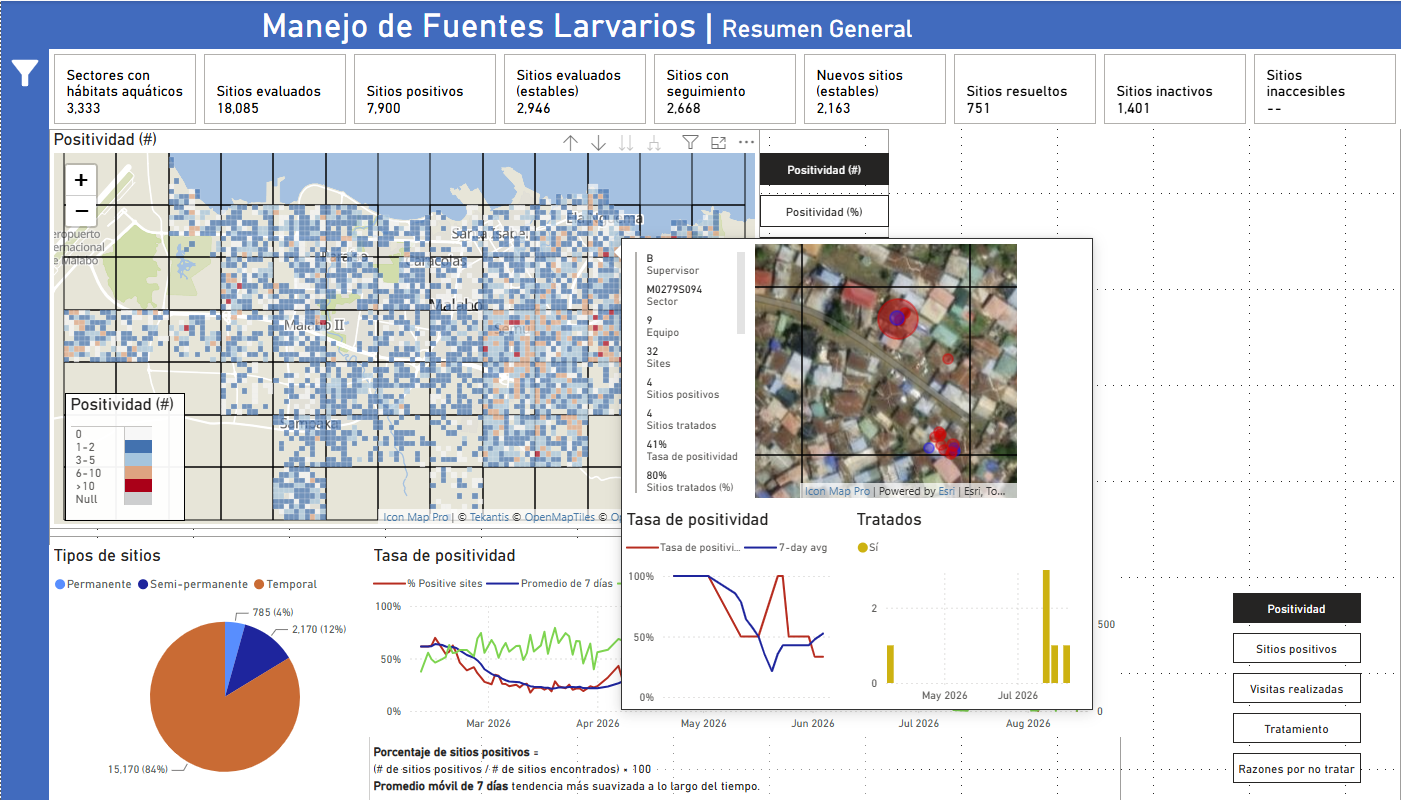
Bringing Malaria Data to Life: How MCD Global Health Uses Icon Map Pro to Power Field Decisions in Equatorial Guinea
MCD Global Health is a public health nonprofit headquartered in Maine, working across more than 50 countries to design and implement health programmes that genuinely change lives. Their international work spans malaria, cervical cancer, health systems strengt…
Enhancing Fiber Deployment and Commercialization with Icon Map Pro at Orange Concessions
Orange Concessions is the leading public-private fiber network operator in rural France. Through long-term public service delegation contracts, it manages a rapidly expanding network infrastructure designed to bring high-speed broadband access to underserved…
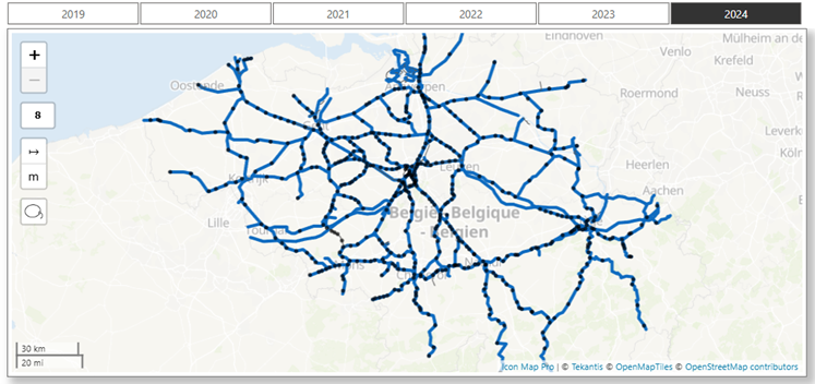
Transforming Rail Safety: The Power of Location Intelligence in Action at SNCB
Safety is a cornerstone of SNCB’s operational strategy. As Belgium’s national railway operator, SNCB places significant emphasis on the safety and security of both passengers and staff. CEO Sophie Dutordoir recently stated that all employees' work "deserves r…
Optimizing Christmas Eve: How Santa Uses Icon Map to Put Every Child on the Map
North Pole Logistics is the exclusive global operator responsible for delivering presents to children who celebrate Christmas. Operating from a single distribution center at the North Pole, the organization must reach more than 900 million homes in one extend…