Icon Map unlocks location-aware insight directly inside Power BI or Microsoft Fabric, turning routine NHS data into actionable intelligence for safer, leaner, and more equitable care.
Operational Efficiency & Patient Experience
Leverage advanced geospatial visualization to streamline clinical operations, shorten waiting times, and proactively manage hospital environments. Real-time and historic spatial analytics will enhance patient safety, bed availability, and service responsiveness.
ED & ambulance arrival heat-maps
Visualize live ambulance handovers and emergency-department arrivals to manage congestion, staffing, and four-hour breaches.
Bed capacity & ward occupancy mapping
Monitor real-time bed status across sites, accelerate admissions and discharge planning, and reduce out-of-area placements.
Theater & diagnostics utilization
Map operating theaters, imaging suites, and equipment availability to maximize throughput and cut cancellations.
Infection-prevention hotspot tracking
Detect spatial clusters of HCAIs, target cleaning teams, and contain outbreaks swiftly.
Facilities & estates maintenance mapping
Track maintenance tasks and medical-equipment faults spatially, minimizing downtime and improving compliance.
Energy & sustainability dashboards
Monitor energy consumption and waste streams across estates, supporting NHS Net Zero and ESG objectives.
Three Healthcare Questions, Live in Icon Map
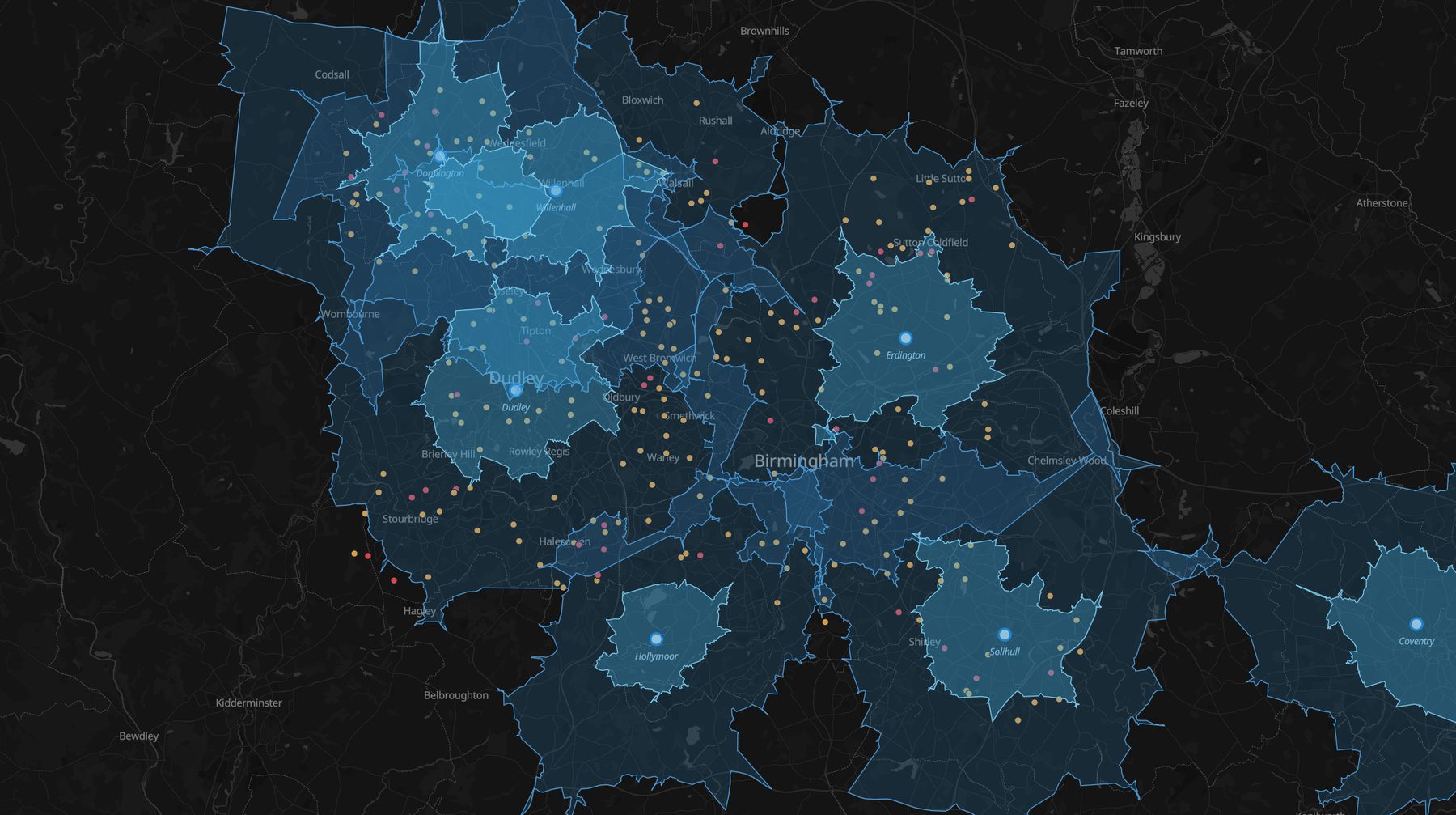
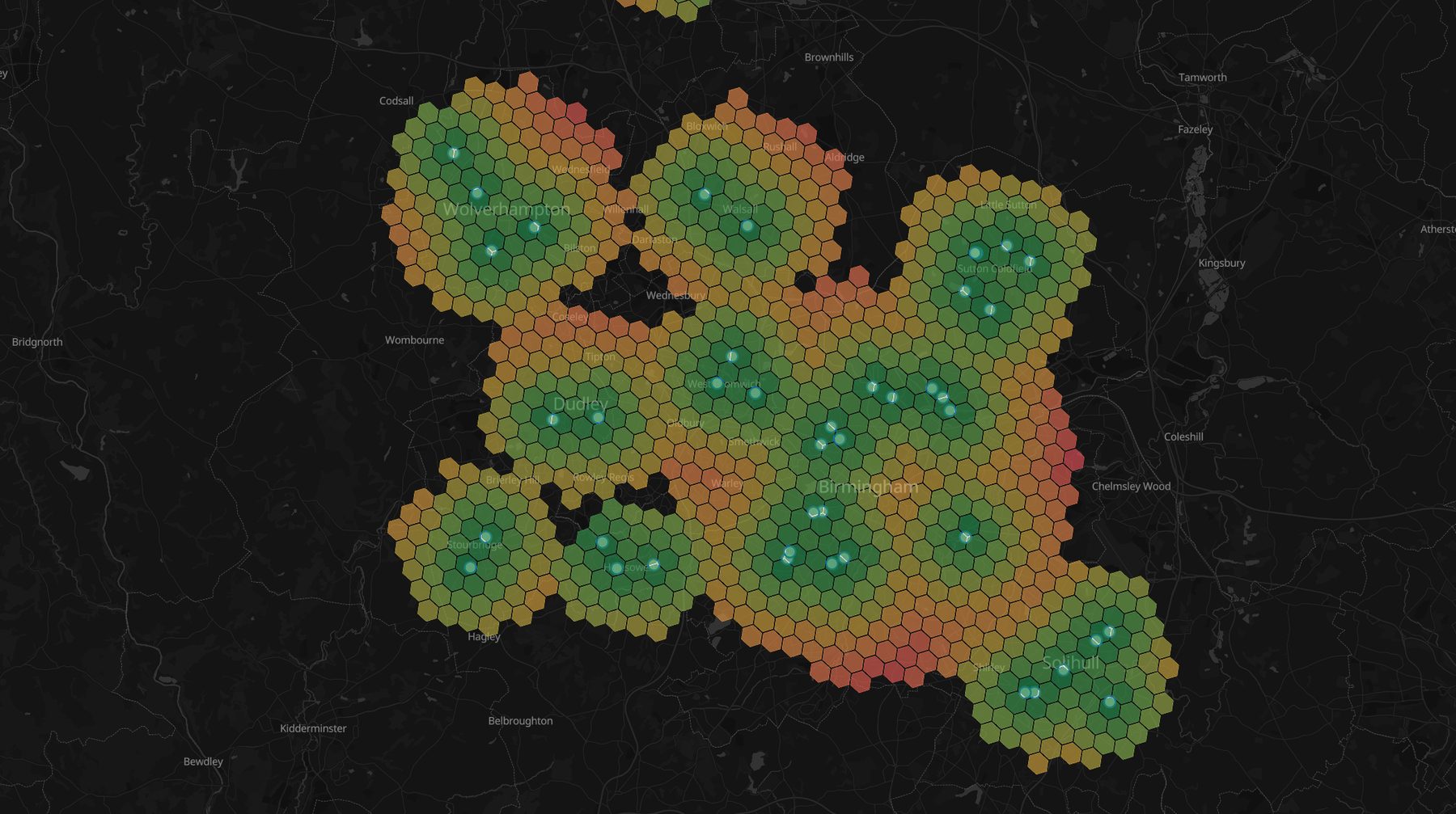
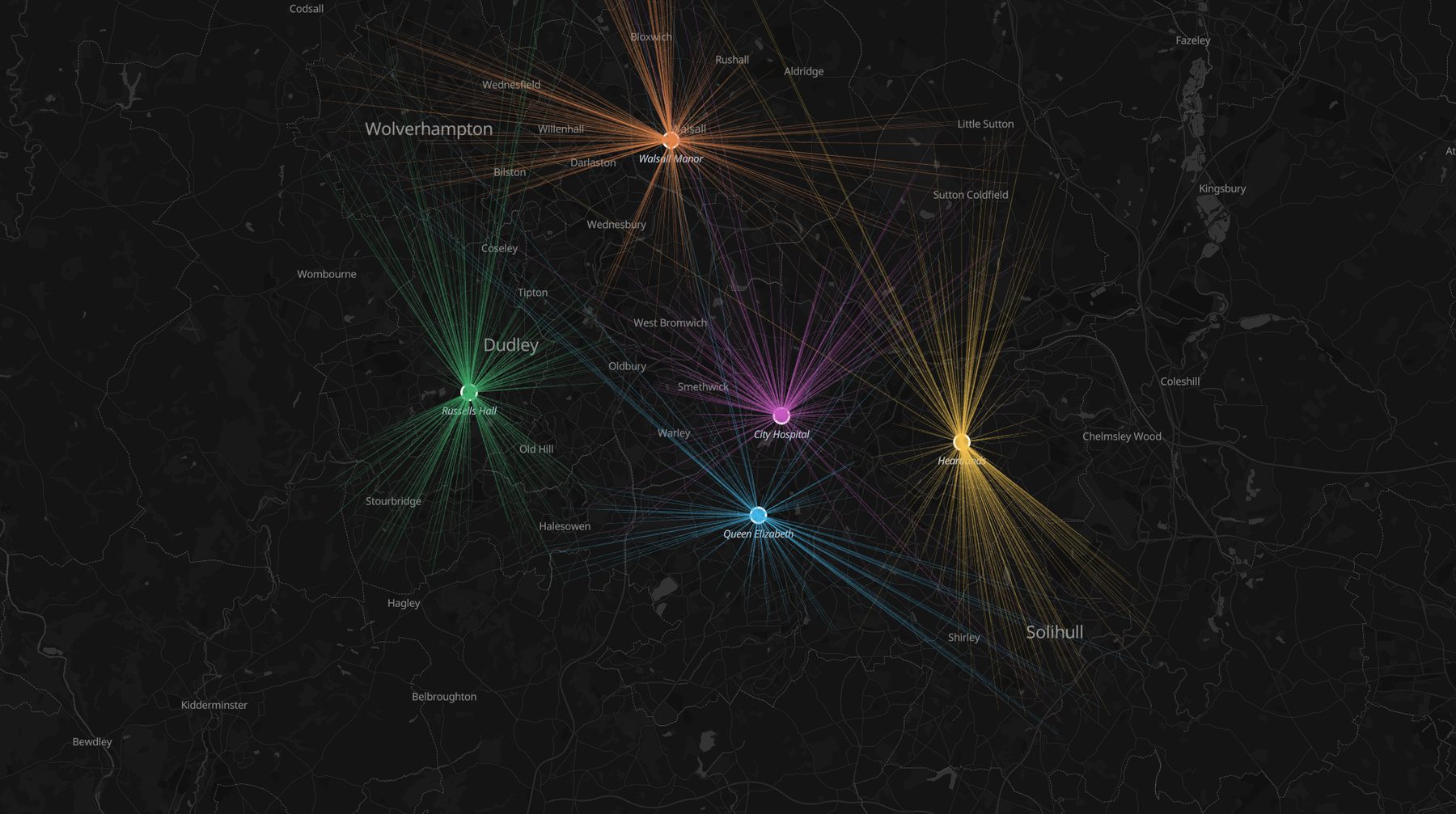
Real Icon Map renders of three healthcare questions - response coverage, access to care, and patient flows - built from plain tables. Everything runs client-side in Power BI or Microsoft Fabric: patient-level locations are among the most sensitive data an organization holds, and with Icon Map they never leave your tenant - no geocoding or routing API in the path.
Response coverage, honestly. 5- and 10-minute drive areas around each ambulance station over live incidents - Category 1 calls in red. The dark holes are the response gaps, and the incidents inside them are the case for the next station. Rendered live in Icon Map.
Access to primary care. Demand hexbinned by distance to the nearest surgery - amber and red fringes are the access gaps, each hex cross-filtering the practices and outcome charts beside the map.Where patients actually flow. Admissions drawn home-to-hospital, colored by provider - real catchments emerge, and the overlaps are the commissioning conversation.
The same machinery drives estates planning, community-team territories, and deprivation-vs-outcome analysis. Icon Map for Microsoft Fabric is in private preview - join the wait list to run these analyses on your own data.Icon Map for Microsoft Fabric is generally available - start a free 30-day trial from inside Fabric or buy a plan to run these analyses on your own data. The same map, chart, and cross-filter machinery is available today in Icon Map Pro for Power BI.
All locations and incidents are synthetic; the drive-time, aggregation, and rendering engines are the shipped product.
Population Health & Service Planning
Combine demographic, epidemiological, and operational data in spatial context to inform equitable service provision, optimize resource allocation, and improve long-term health outcomes.
Demographic & deprivation overlay
Map population characteristics, deprivation indices, and long-term-condition prevalence to target resources where need is highest.
Service coverage & travel-time analysis
Assess drive-time and public-transport access to A&E, GP, pharmacy, and community services, highlighting geographic care gaps.
Vaccination & screening uptake tracking
Visualize coverage for immunization, cancer screening, and health checks to focus outreach and reduce inequalities.
Referral & care-pathway flow mapping
Track patient journeys between primary, secondary, and tertiary care to expose bottlenecks and improve pathway design.
Surge-capacity & winter-pressure modeling
Overlay historic demand patterns with population forecasts to plan beds, staffing, and supplies for seasonal or pandemic surges.
Partner & private-provider landscape analysis
Map neighboring trusts, private hospitals, and community partners to inform commissioning, collaboration, and risk mitigation.
For more information on HIPAA and NHS compliance, data protection, and how Icon Map fits healthcare governance, see our Healthcare Compliance documentation.
Why Choose Icon Map?
Our customer success stories
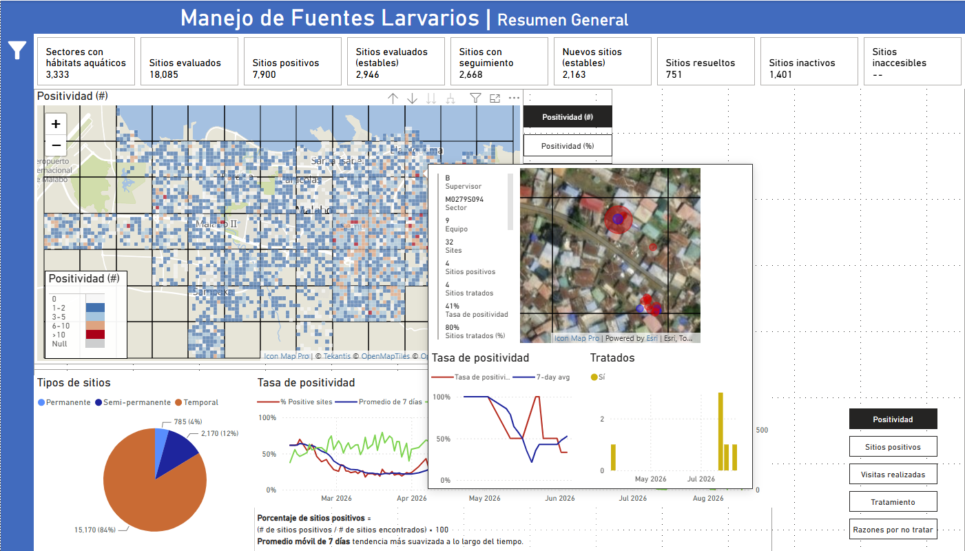
Bringing Malaria Data to Life: How MCD Global Health Uses Icon Map Pro to Power Field Decisions in Equatorial Guinea
MCD Global Health is a public health nonprofit headquartered in Maine, working across more than 50 countries to design and implement health programmes that genuinely change lives. Their international work spans malaria, cervical cancer, health systems strengt…
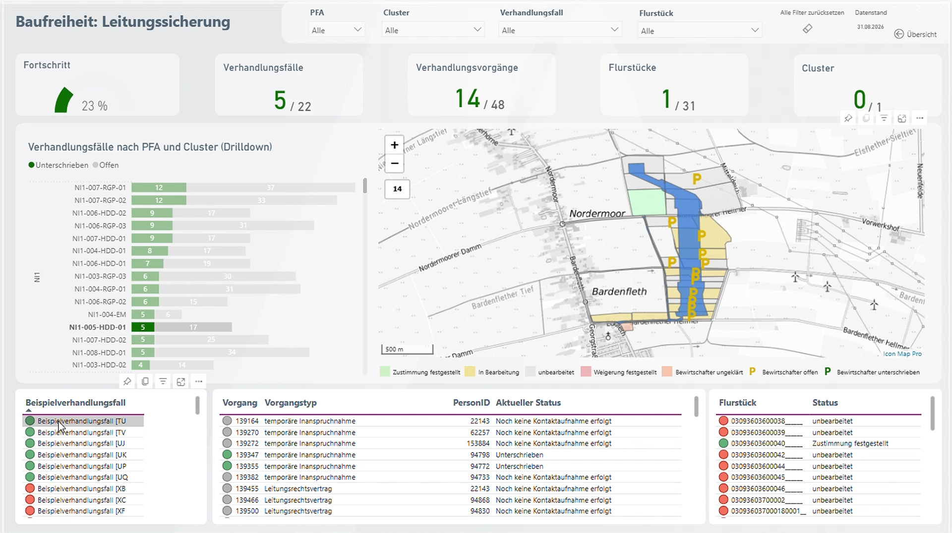
Amprion: Bringing Large-Scale Transmission Infrastructure onto a Single Map
Amprion is one of Germany’s four transmission system operators, responsible for operating and expanding a critical part of Germany’s high-voltage electricity grid. Among its major infrastructure programmes is the Rhein-Main-Link, a planned underground HVDC c…
Enhancing Fiber Deployment and Commercialization with Icon Map Pro at Orange Concessions
Orange Concessions is the leading public-private fiber network operator in rural France. Through long-term public service delegation contracts, it manages a rapidly expanding network infrastructure designed to bring high-speed broadband access to underserved…
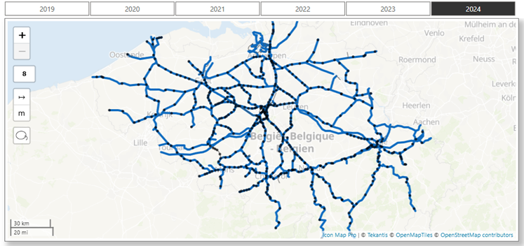
Transforming Rail Safety: The Power of Location Intelligence in Action at SNCB
Safety is a cornerstone of SNCB’s operational strategy. As Belgium’s national railway operator, SNCB places significant emphasis on the safety and security of both passengers and staff. CEO Sophie Dutordoir recently stated that all employees' work "deserves r…
Optimizing Christmas Eve: How Santa Uses Icon Map to Put Every Child on the Map
North Pole Logistics is the exclusive global operator responsible for delivering presents to children who celebrate Christmas. Operating from a single distribution center at the North Pole, the organization must reach more than 900 million homes in one extend…