Industry solutions · Infrastructure Management and Utilities
Why Icon Map for Infrastructure and Utilities?
When a storm crosses the network, every minute counts: which lines have tripped, which substations are flooding, where the crews are and who is off supply. Icon Map puts the whole network, the weather and every alert on one live map, from the national picture down to a single tower in 3D, inside the Power BI reports and Microsoft Fabric workspaces you already use.
The Swiss transmission grid (Swiss Federal Office of Energy) with an illustrative operator and a fictional storm · imagery and terrain: swisstopo · 3D in Icon Map for Fabric
Network operations you can see
The whole network, every alert, in context
SCADA, protection relays, substation sensors, weather services and work management already put the state of every asset in your data platform. Icon Map shows it where it is: the line that tripped, the tower that fell, the substation the river is rising towards, the crew on its way, and the customers waiting for power.
Build network and asset reports in Power BI with Icon Map Pro, or bring live telemetry, 3D assets, weather and playback together in Microsoft Fabric with Icon Map for Fabric. One organization-wide license, no extra GIS software.
The grid as it runsEvery circuit colored by state and loading, with power flowing along it, and faults, trips and restoration as they happen.
Weather on the same mapWind, rain radar, lightning and official warnings over your assets, so the risk is seen before the trip.
From the country to one towerZoom from the national picture into a substation or a span in 3D, on real terrain and aerial imagery, in Icon Map for Fabric.
Made for the control room wallA big-screen wall view with system status, the alert stream and warnings, beside the map that explains them.
Transmission grid · Switzerland · Storm Orvane
A grid control room through a storm
The real Swiss 380 kV and 220 kV grid as a fictional storm crosses the country: lines trip and come down, substations near rising rivers raise flood alarms, warnings are issued and crews are dispatched, until the last circuit is restored. Click an alert or zoom in to see the detail in 3D. The operator and the storm are illustrative.
-
Network: electrical installations above 36 kV (Swiss Federal Office of Energy, open government data), towers from OpenStreetMap. Imagery, terrain and buildings: swisstopo (SWISSIMAGE, swissALTI3D, swissBUILDINGS3D). River flood statistics: FOEN hydrology. The operator, Storm Orvane and every fault, alarm, warning and crew movement are fictional. 3D assets, live telemetry, playback and weather are features of Icon Map for Fabric.
How it works
Your systems, on one map
Connect what you have
SCADA and the energy management system, protection and sensor telemetry, the asset register, work management and weather services, into Microsoft Fabric through Eventstream or Data Factory.
Build the network twin
Lines, towers and substations from your GIS, on terrain and aerial imagery from the Icon Map Catalog, with 3D towers and substation equipment that string their own conductors.
Act on it
System status, alerts, warnings and restoration progress beside the map, on the control room wall and in your Power BI and Fabric reports, filtering together.
Across networks and assets
Where utilities and infrastructure teams use Icon Map
Outage and fault management
Trips, faults and customers off supply on the map as they happen, with crews, restoration progress and estimated restoration times.
Severe weather readiness
Forecast wind, rain, snow and lightning over lines and substations, with the assets most at risk ranked before the storm arrives.
Flood and climate resilience
River levels and flood zones against substations and cable routes, sensor alarms on site, and where barriers and pumps are needed.
Asset health and inspection
Condition, age and inspection findings by tower, span and bay, with drone and helicopter patrol imagery where it was taken.
Vegetation management
Tree fall risk and clearance along every span, from aerial and LiDAR data, with work planned where the risk is highest.
Load and capacity planning
Loading by circuit and substation, constraints and where new connections, storage and renewables can join the network.
Field crews and logistics
Crews, vehicles, helicopters and stores on the map, dispatched to the nearest fault with the parts they need.
Security and compliance
Site access, intrusion and safety events at substations, and regulatory reporting of interruptions by region.
Why Choose Icon Map?
Our customer success stories
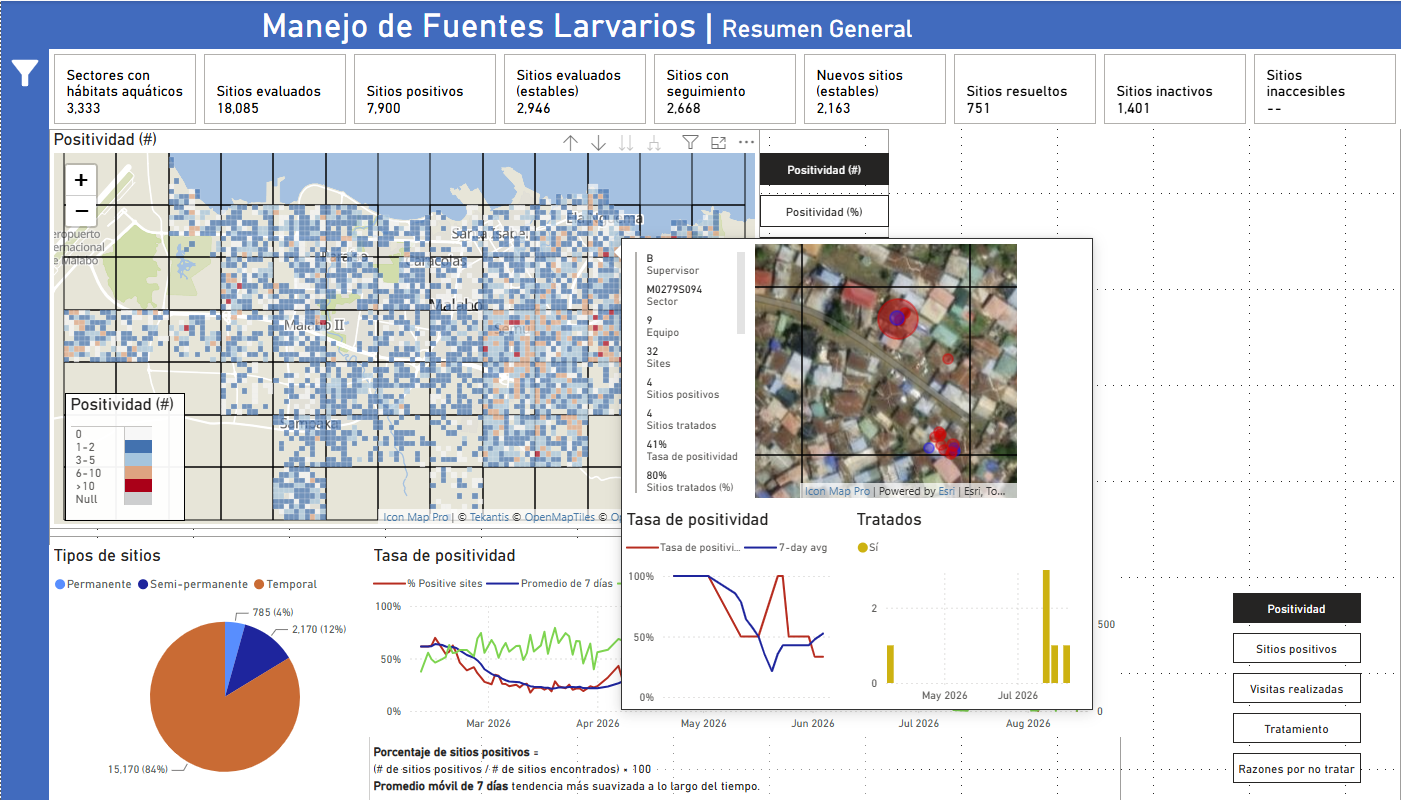
Bringing Malaria Data to Life: How MCD Global Health Uses Icon Map Pro to Power Field Decisions in Equatorial Guinea
MCD Global Health is a public health nonprofit headquartered in Maine, working across more than 50 countries to design and implement health programmes that genuinely change lives. Their international work spans malaria, cervical cancer, health systems strengt…
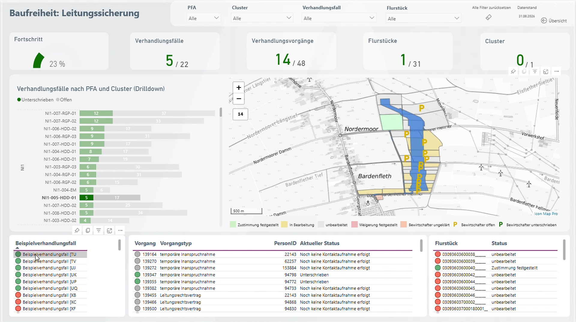
Amprion: Bringing Large-Scale Transmission Infrastructure onto a Single Map
Amprion is one of Germany’s four transmission system operators, responsible for operating and expanding a critical part of Germany’s high-voltage electricity grid. Among its major infrastructure programmes is the Rhein-Main-Link, a planned underground HVDC c…
Enhancing Fiber Deployment and Commercialization with Icon Map Pro at Orange Concessions
Orange Concessions is the leading public-private fiber network operator in rural France. Through long-term public service delegation contracts, it manages a rapidly expanding network infrastructure designed to bring high-speed broadband access to underserved…
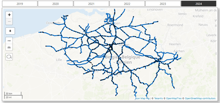
Transforming Rail Safety: The Power of Location Intelligence in Action at SNCB
Safety is a cornerstone of SNCB’s operational strategy. As Belgium’s national railway operator, SNCB places significant emphasis on the safety and security of both passengers and staff. CEO Sophie Dutordoir recently stated that all employees' work "deserves r…
Optimizing Christmas Eve: How Santa Uses Icon Map to Put Every Child on the Map
North Pole Logistics is the exclusive global operator responsible for delivering presents to children who celebrate Christmas. Operating from a single distribution center at the North Pole, the organization must reach more than 900 million homes in one extend…
Build network and asset reports in Power BI with Icon Map Pro, or bring live telemetry, 3D assets, weather and playback together in Microsoft Fabric with Icon Map for Fabric.
Grid: SFOE · imagery and terrain: swisstopo · illustrative operator and stormPlayPauseWall modeExit wall modeShow the map full screenThis live map could not load. Please check your connection and refresh the page.Use Ctrl + scroll to zoom the mapUse ⌘ + scroll to zoom the mapUse two fingers to move the map